
OHNY Brochure
-
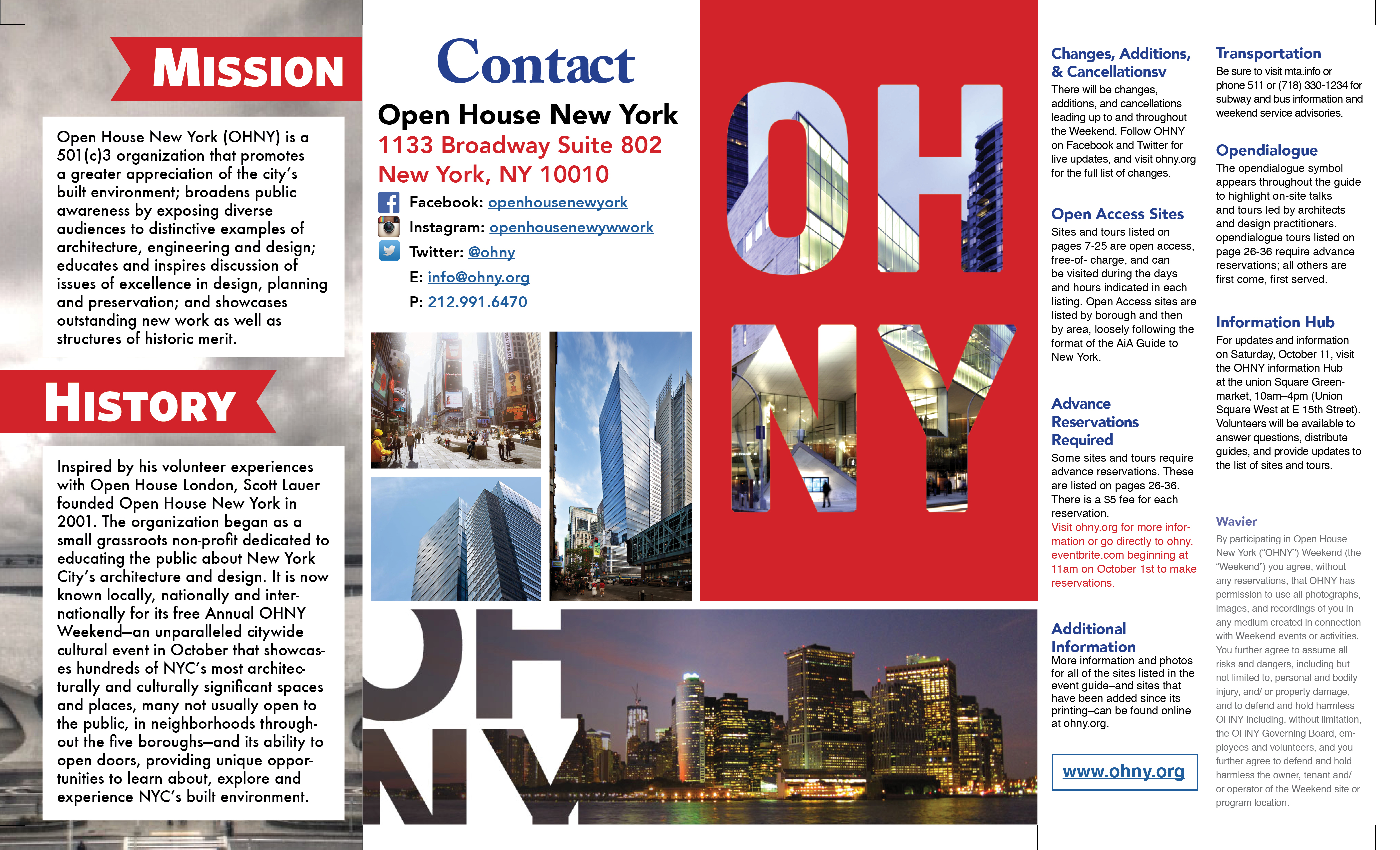
Front Page Layout
This is the front page of the final layout for my brochure, consisting of four equally spaced sections set up to be the front cover, back cover and the two first fold inside pages consisting of information about OHNY.
-
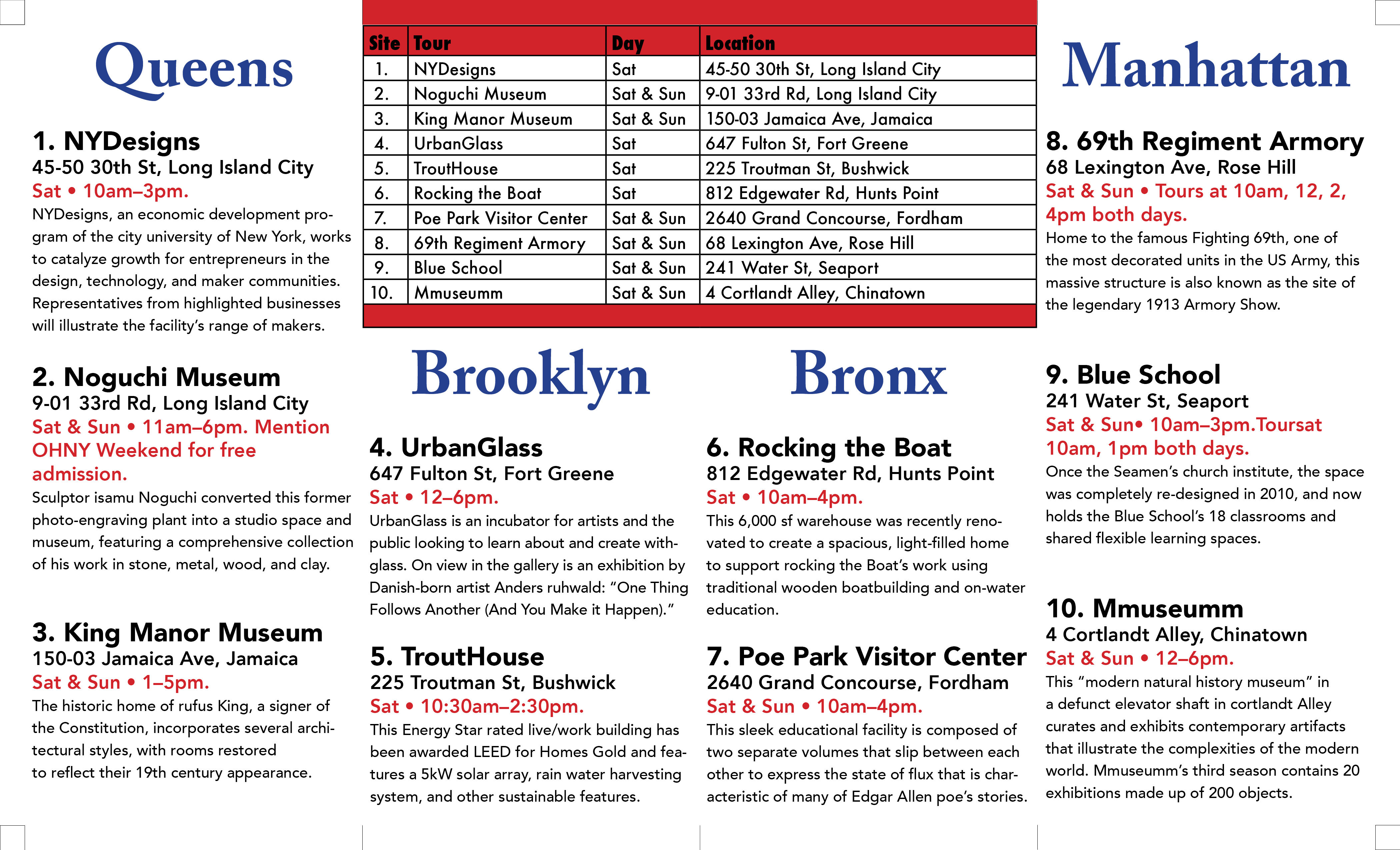
Back Page Layout
This is the back page of the final layout for my brochure, consisting of four equally spaced sections set up to be the events for each borough of NYC with a corresponding table chart for important information regarding each event.
-
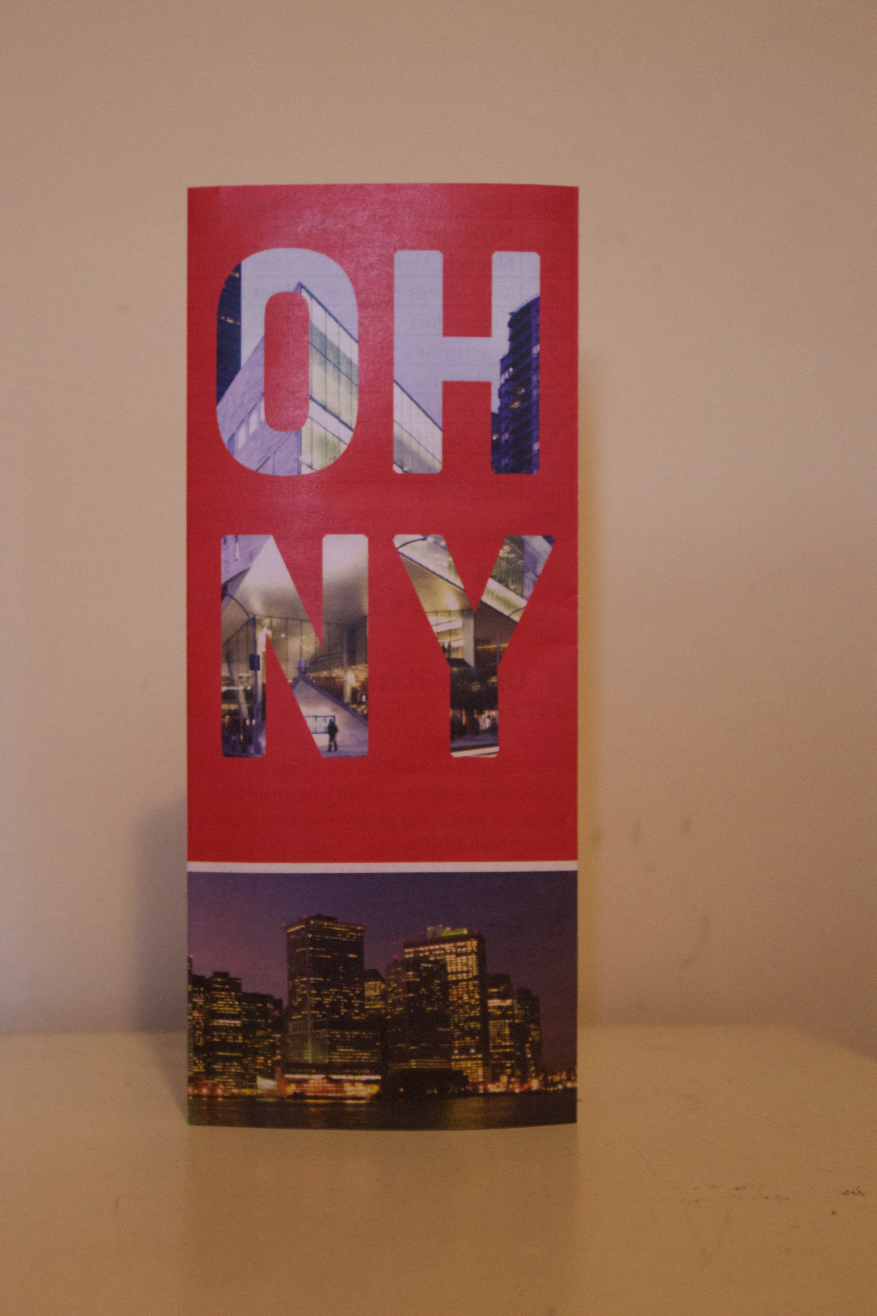
Cover
This is final printed version of the front cover for my brochure, consisting of a masked image as the type with a picture of NYC on the bottom.
-
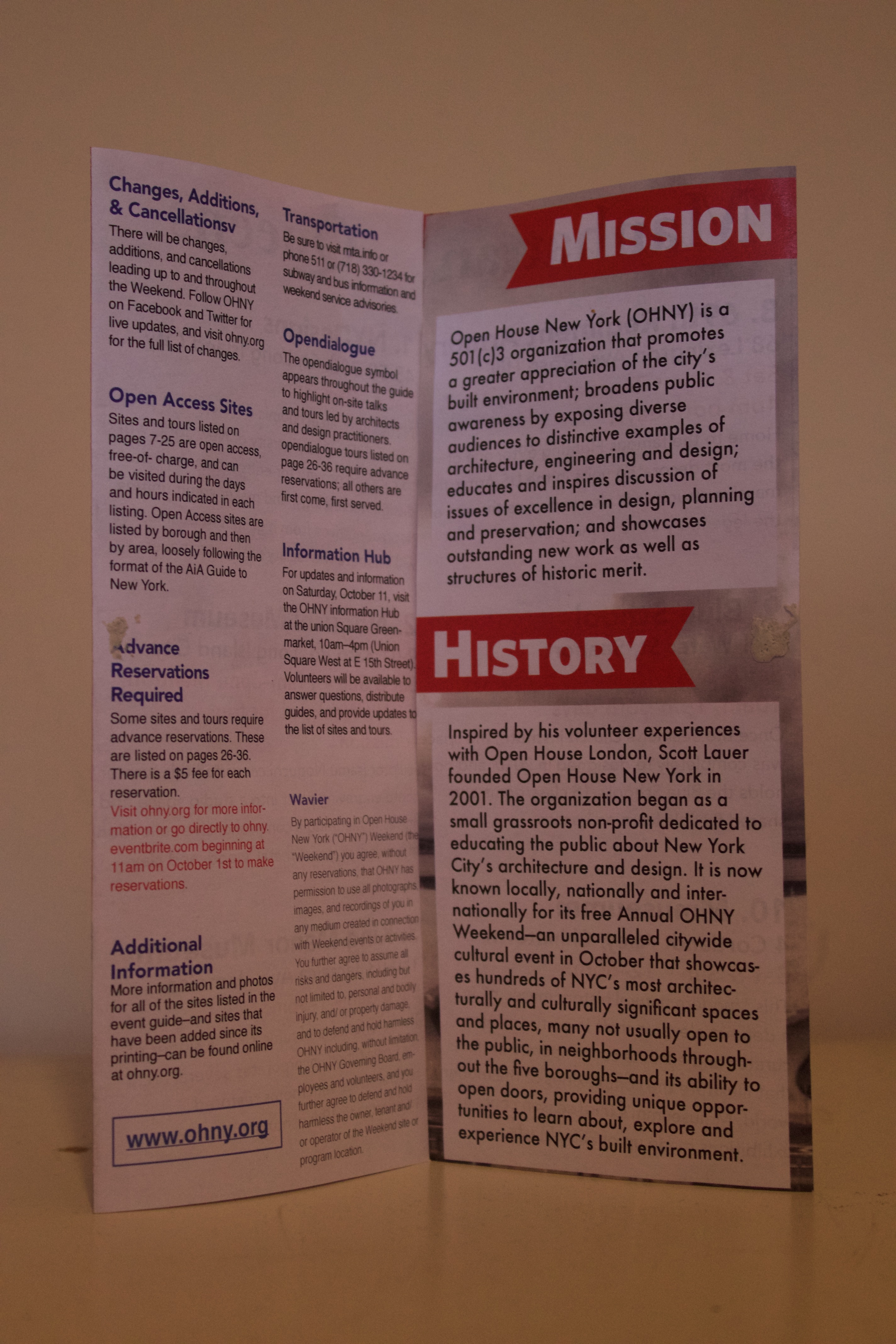
First Fold
This is the inside of the brochure after the first fold is opened, consisting of the mission and history of OHNY along with important information.
-
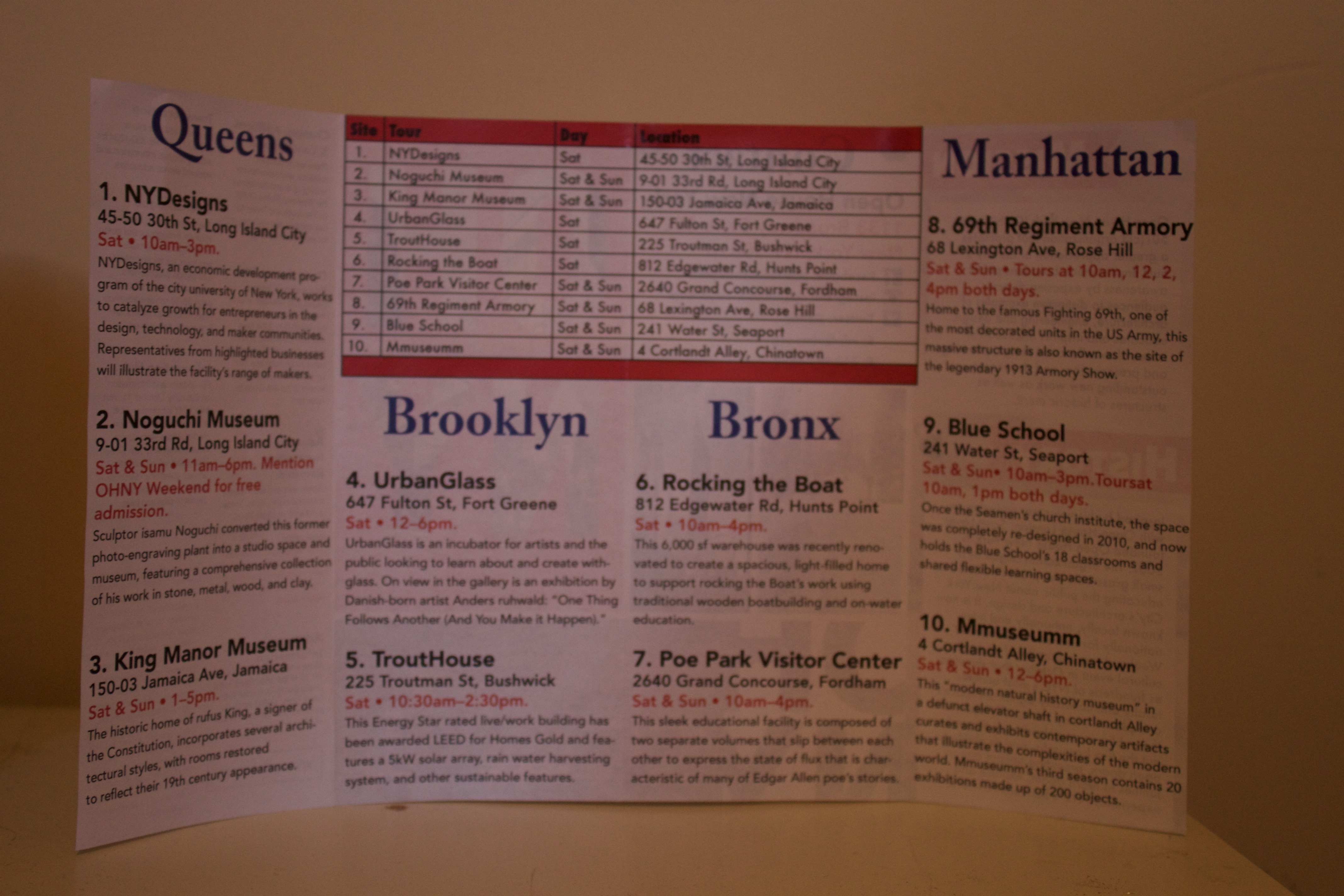
Second Fold
This is the brochure completely opened, revealing all of the information regarding each event with an easy table for specific dates and locations.
Posters
-

Found Type
In this project we had to take our own pictures of found type in our everyday lives. In doing this project, I went through my daily routine and everytime I found an object that resembled a letter, I took a picture of it and did so until i had all 26 letters and 4 punctuation marks. The layout was done using inDesign and the greyscaled in photoshop.
-
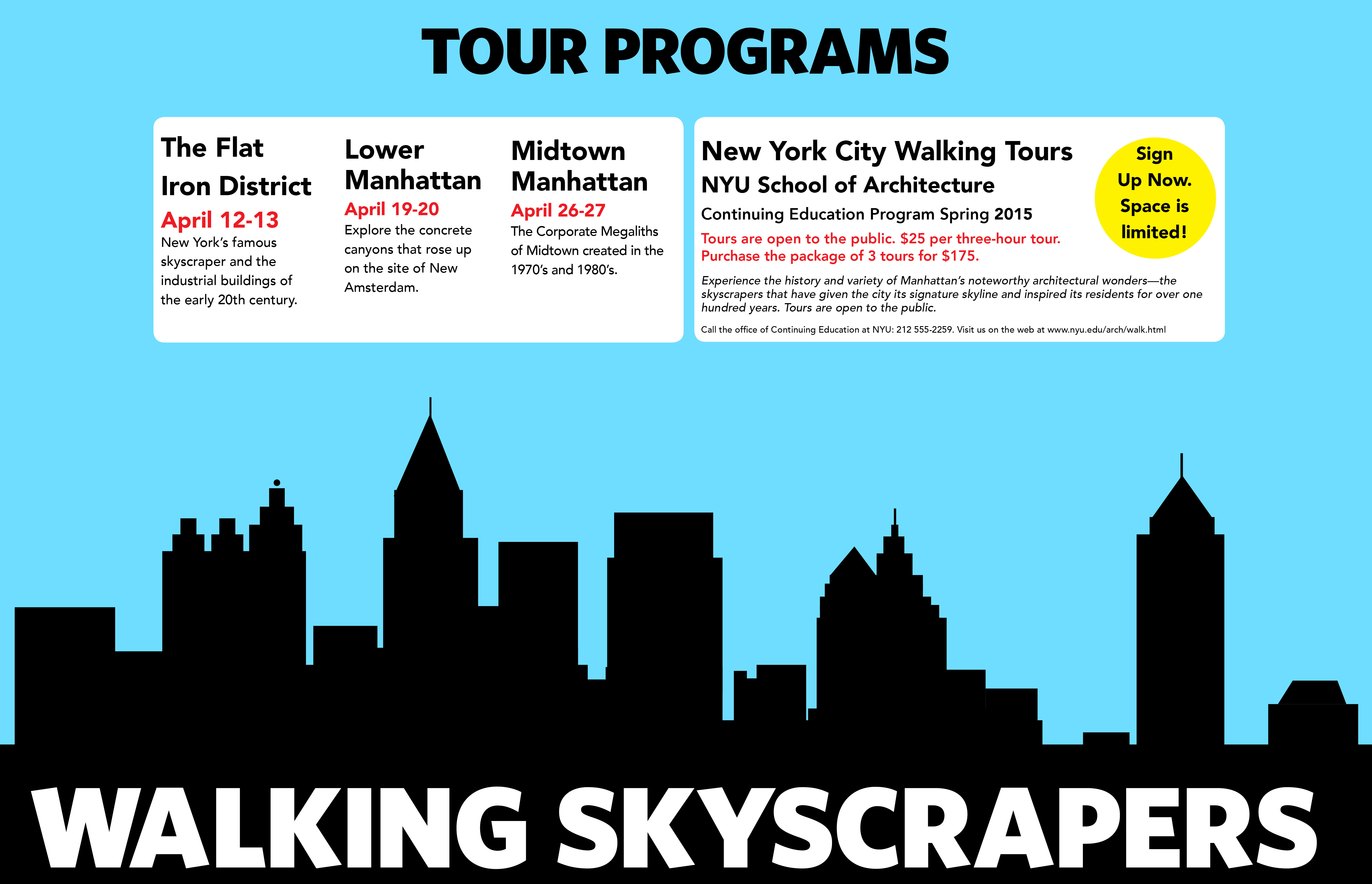
Hierarchy
The purpose of this project was to explore hierarchy and deciphering which texts are more important than other text. In this project we were not aloud to add any photographical images, only text and shapes were accepted.
Expressive Words
-
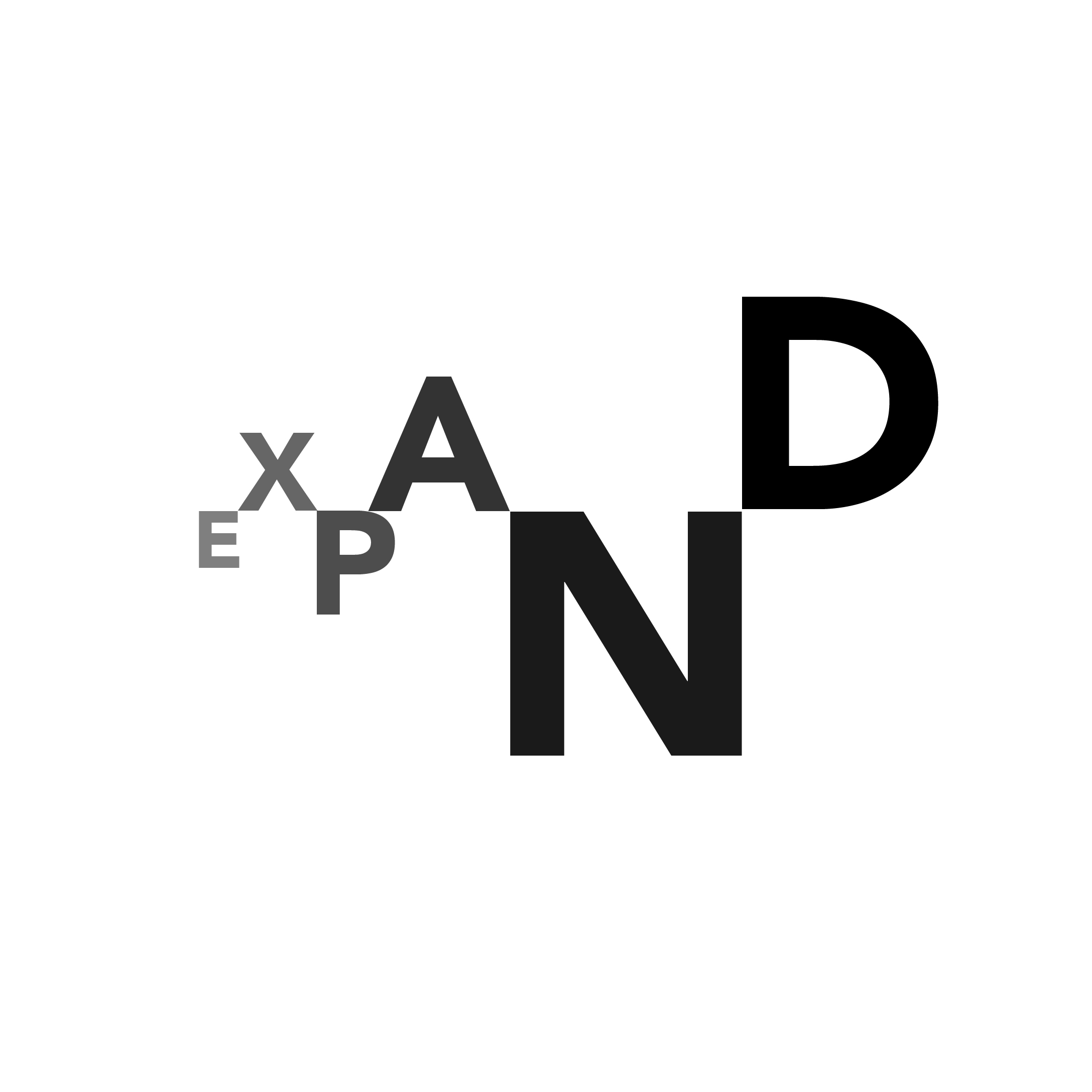
Expand
I expressed the word expand by making the letters gradually enlarge while their opacity increaed exponentially corresponding to their size.
-
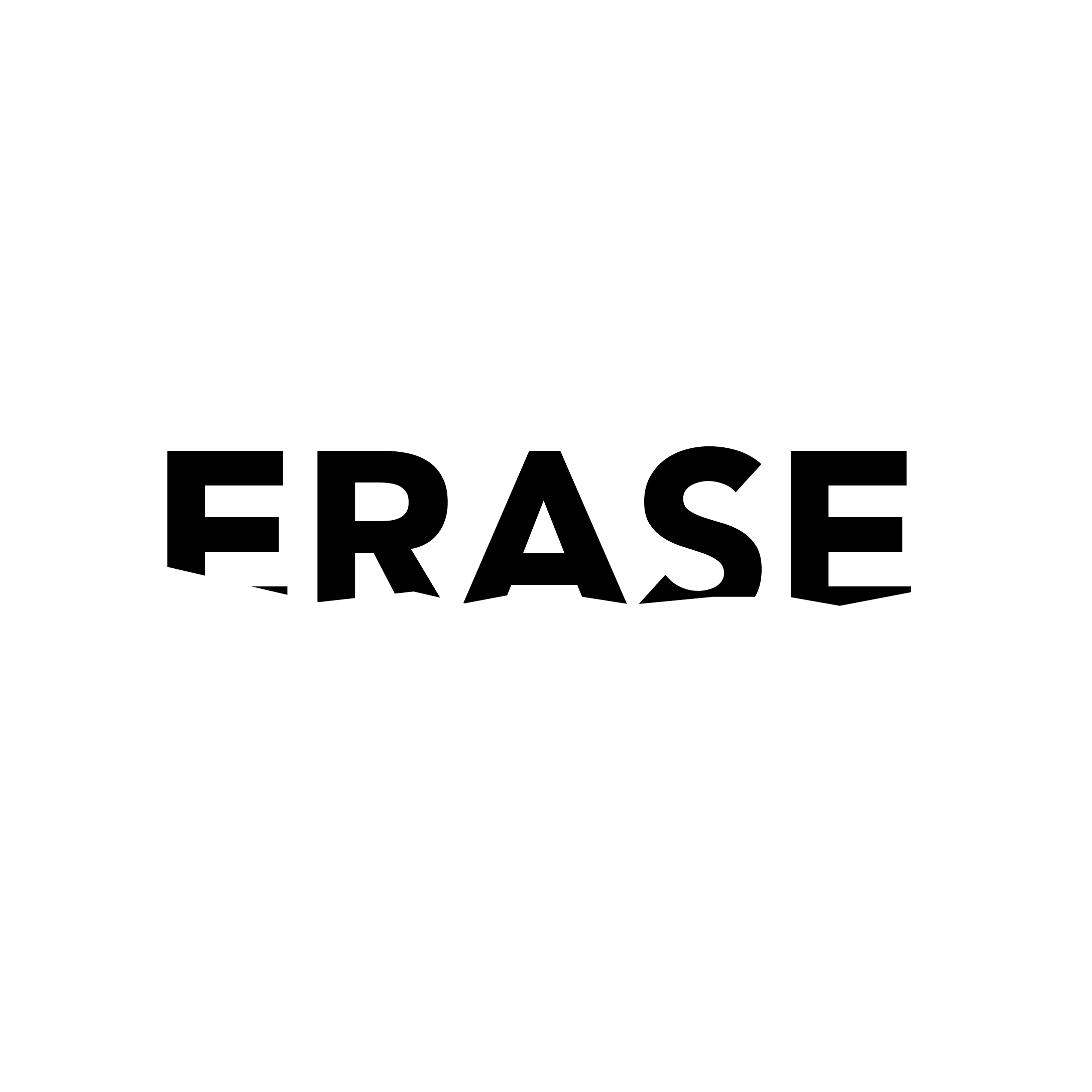
Erase
I expressed the word erase by cutting off the bottom of the word in a jagged, not straight manner to show that its in the process of being erased.
-

Float
I expressed the word float by mirroring the word and placing it directly below with an opacity difference to represent one floating over the other.