
Color Theory
-
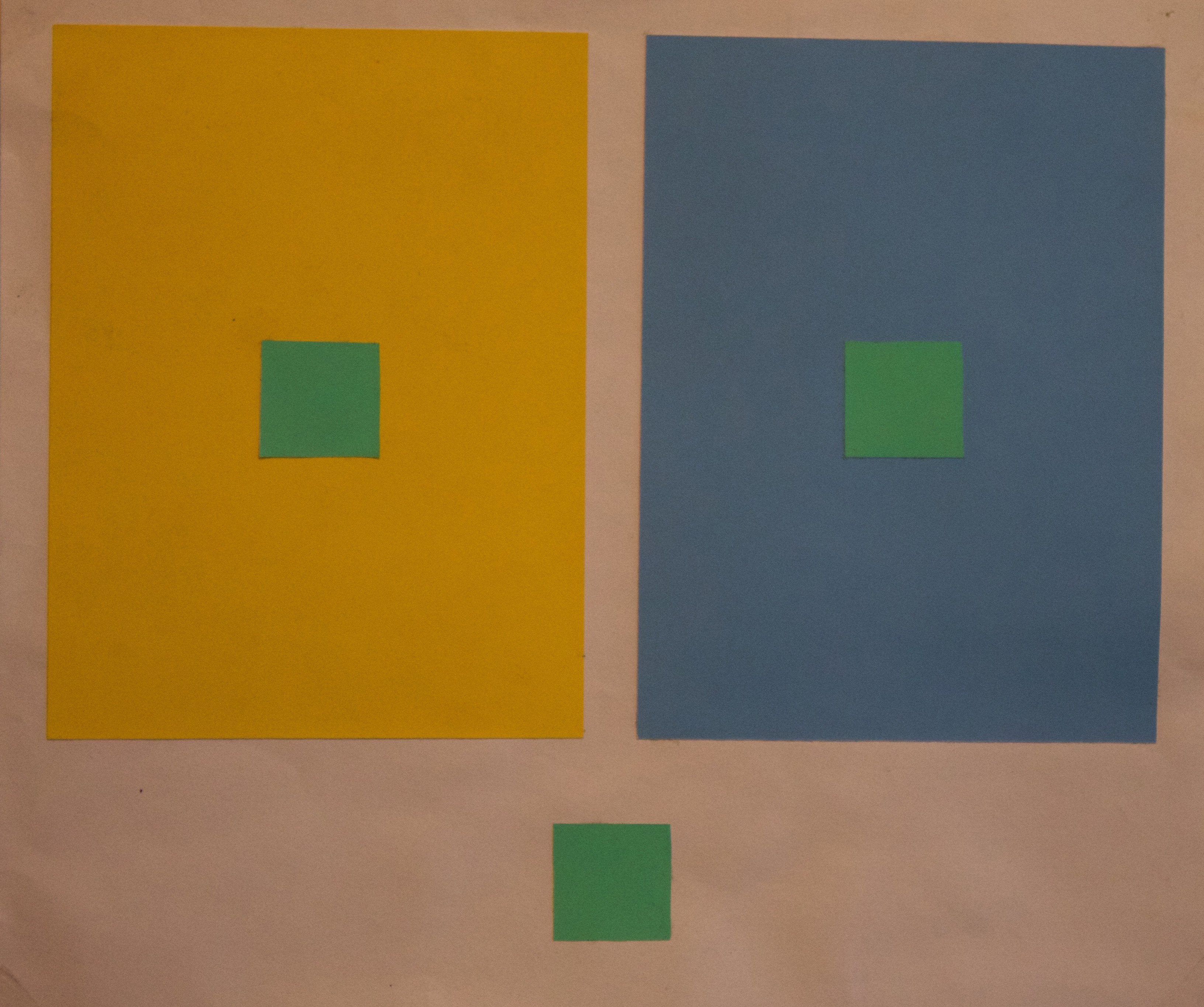
Hue Change
In this project the hue of the small square is always the same but it appears to change value when placed on different background hues.
-
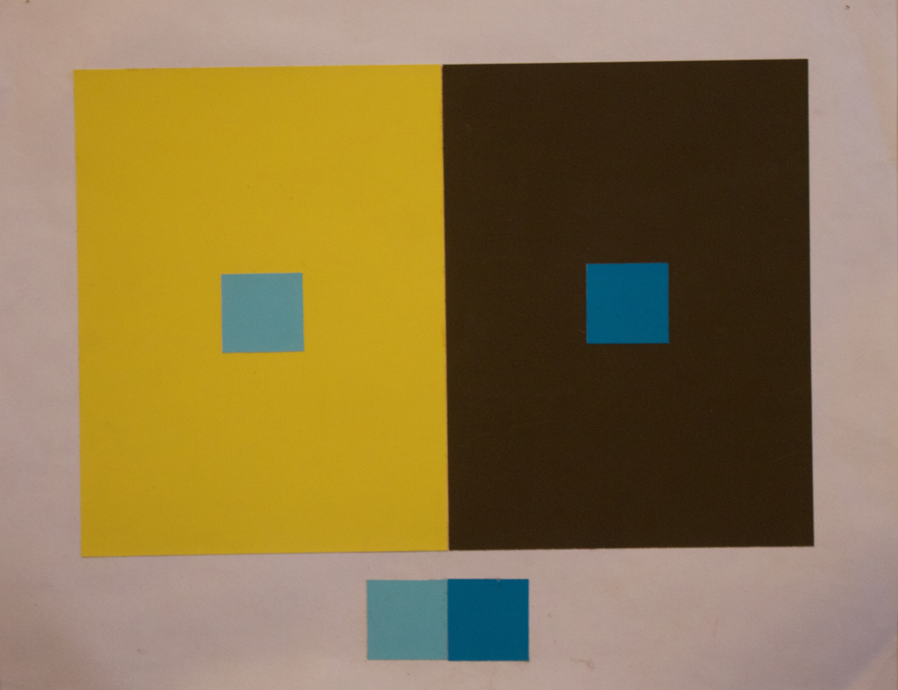
Same Hue Different Values
In this project the two small squares with different values of the same hue appear to be the same value when placed on different background hues.
-
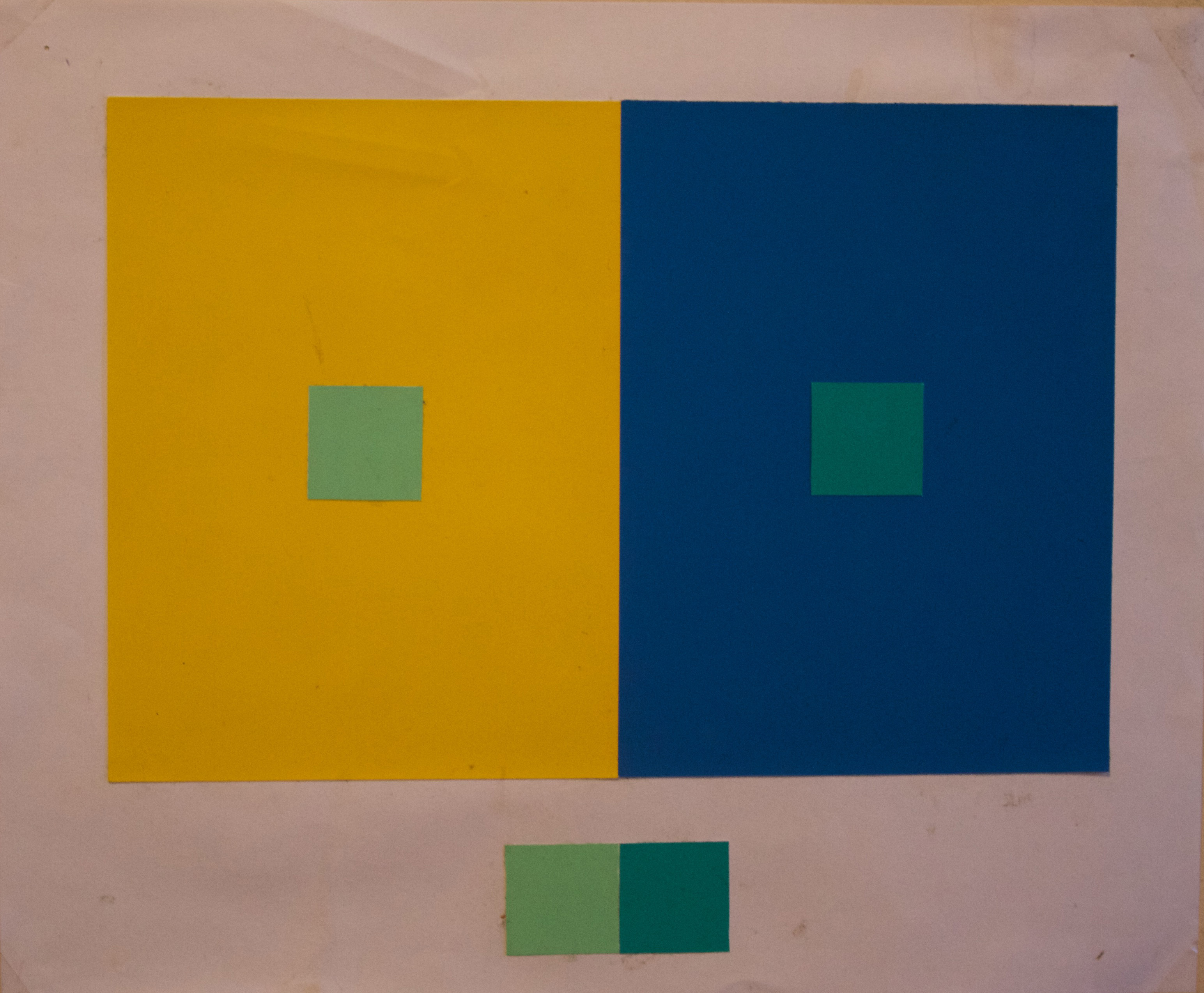
Different Hues Different Values
In this project the two small squares with different hues and values appear to look the same hue and value when placed on different background hues.
-
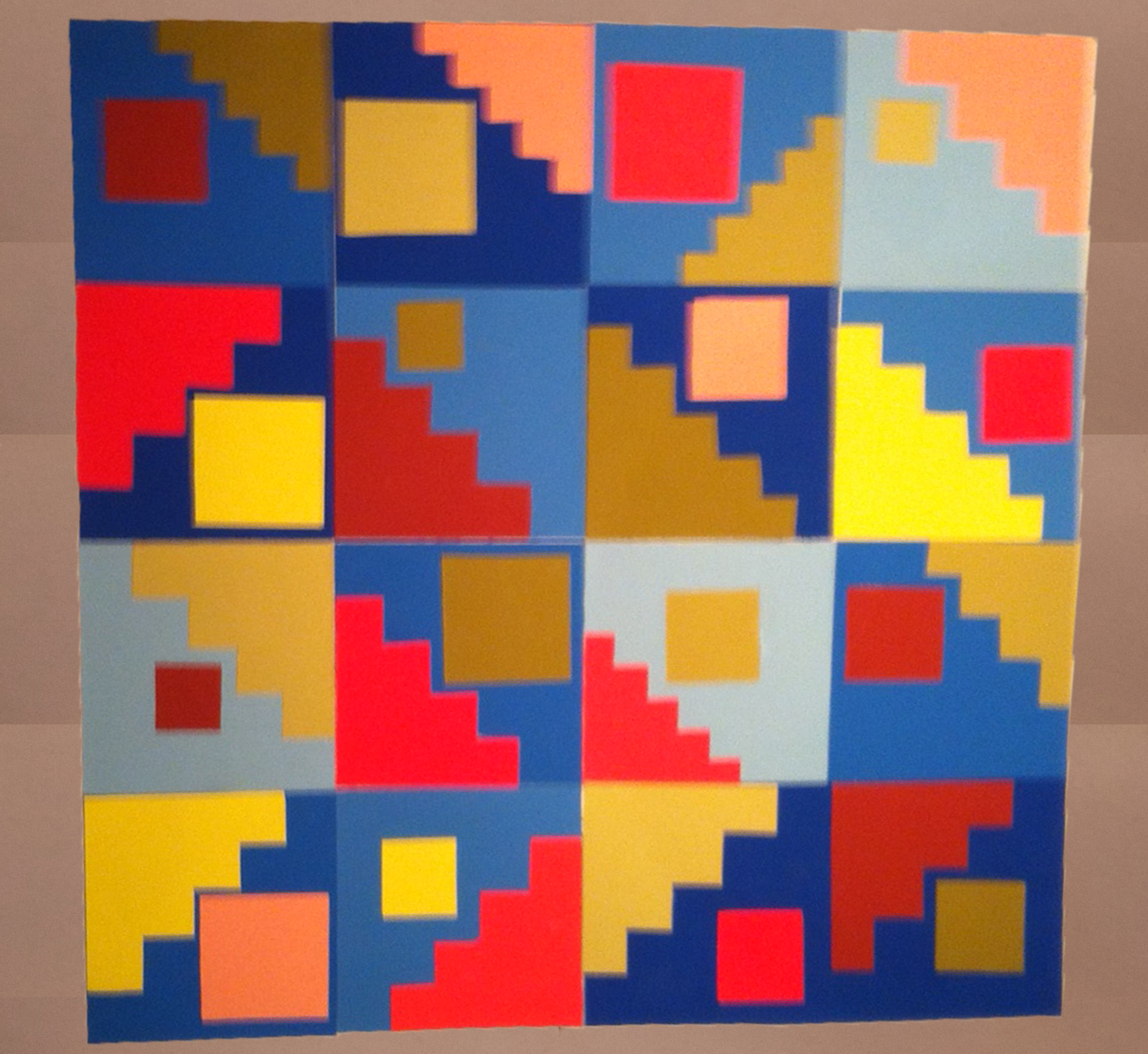
Triad
In this project the concept was to create a grid to form a triad of three different hues and 4 values within each hue through basic straight line shapes.
-
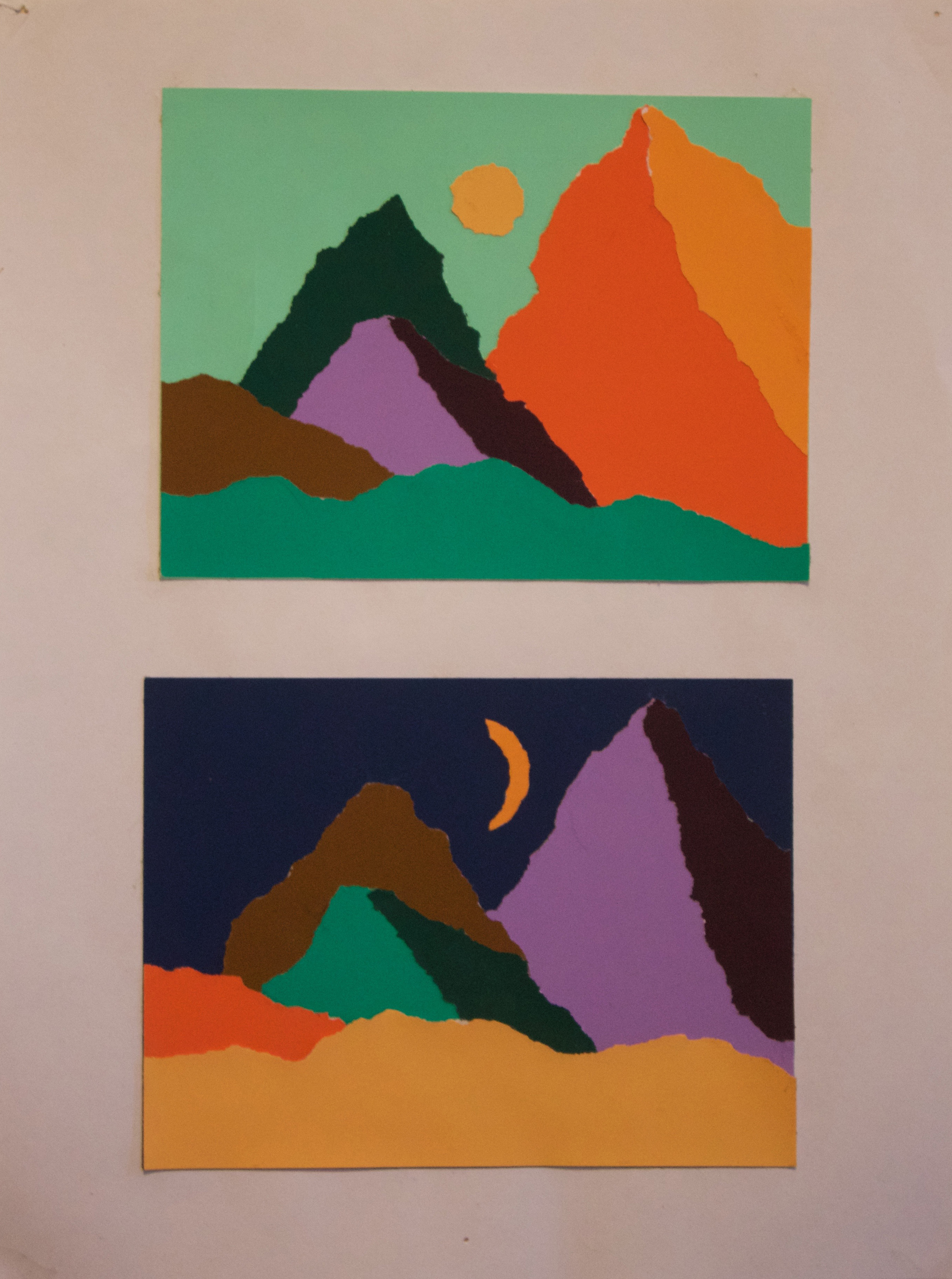
Landscape
In this project the concept was to create a landscape soley with ripping, consisting of 4 different hues and value change within each hue.
-
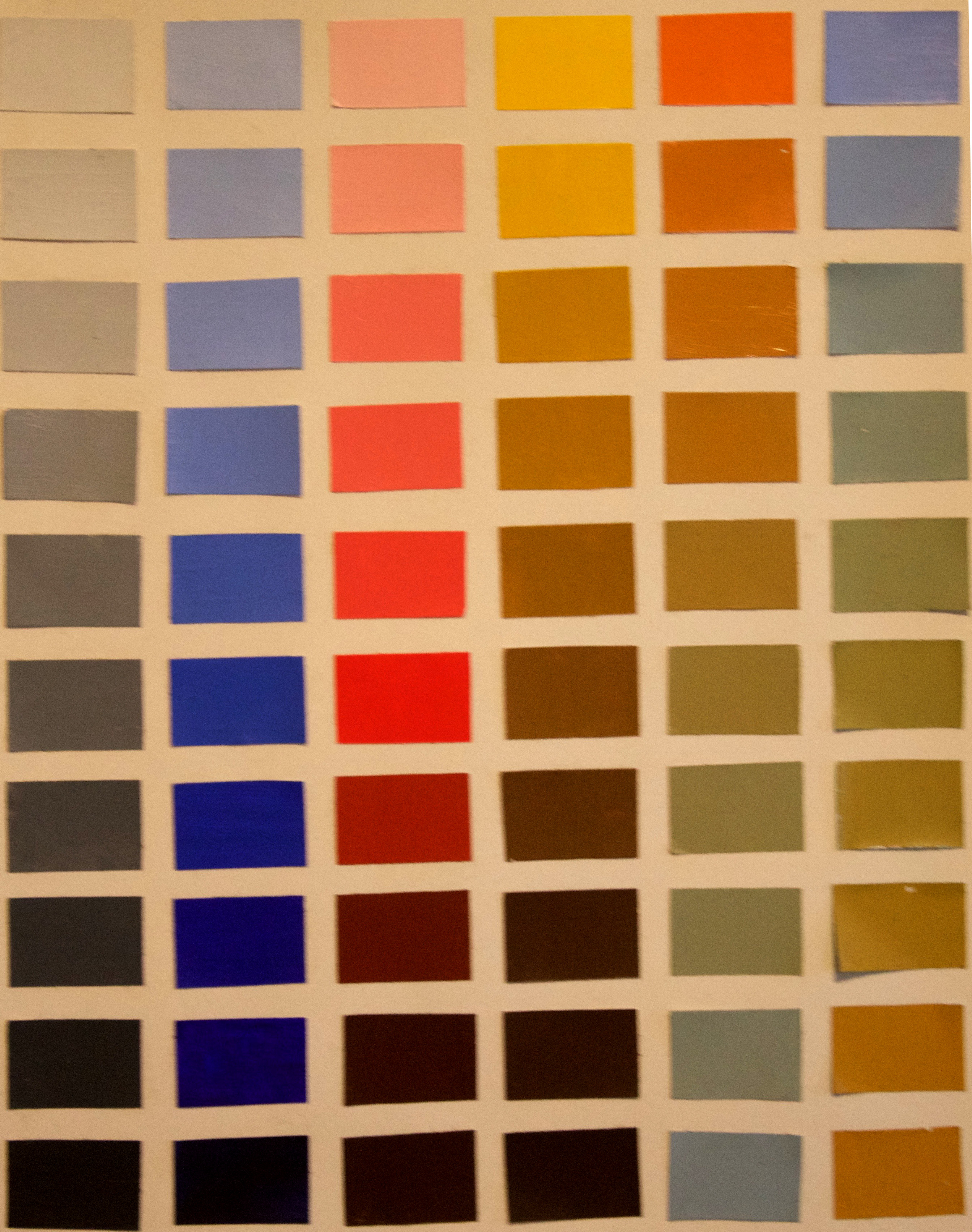
Color Chart
In this project we had to paint a color chart for the value changes of gray, blue, red, and yellow and hue changes from orange-blue and blue-orange.
-
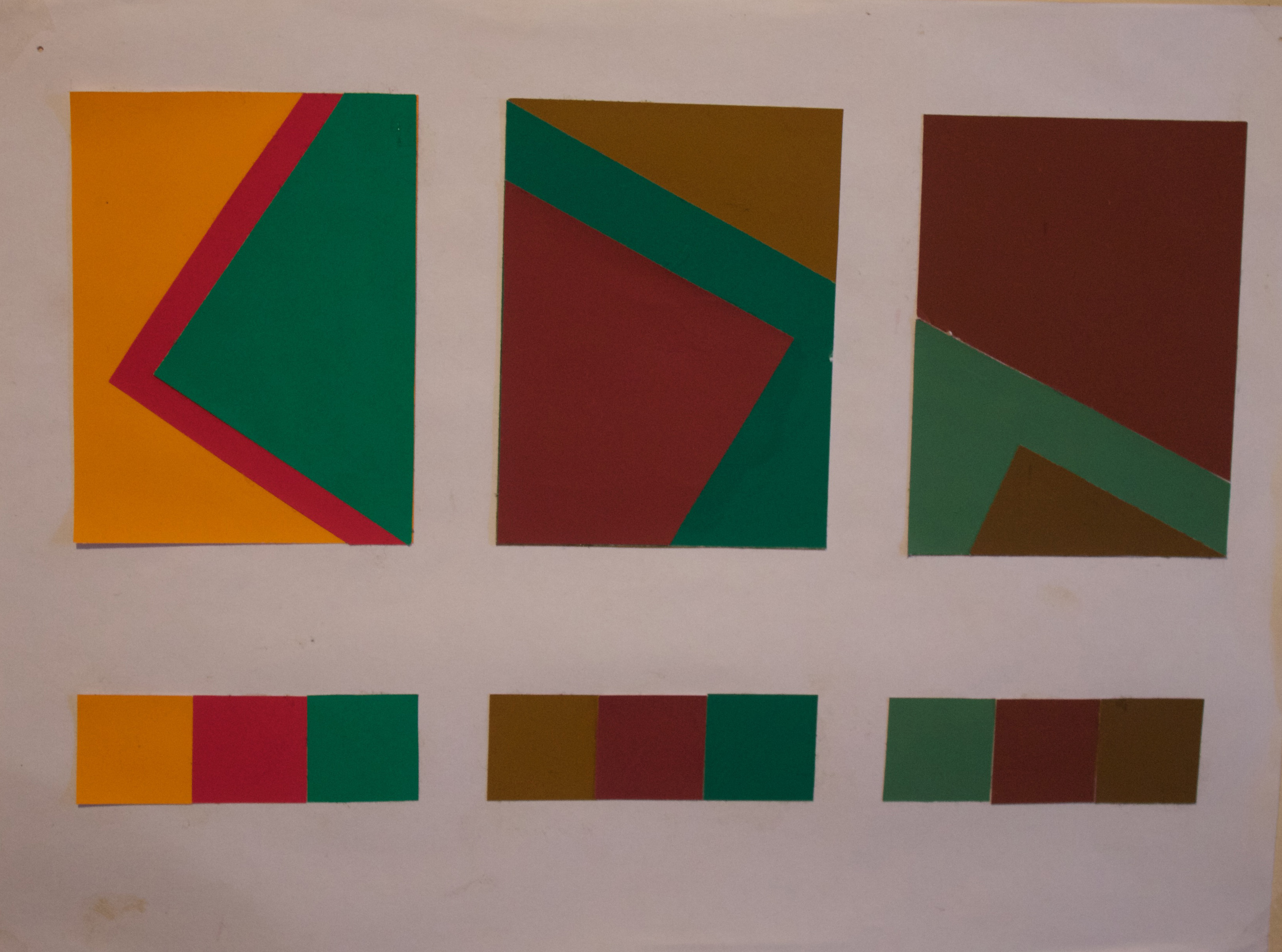
Neutral vs. Intense
In this project the concept was to investigate how neutral backgrounds effect intense foregounds vs. how intense backgrounds effect neutral foregrounds.
Bauhaus Squares
-
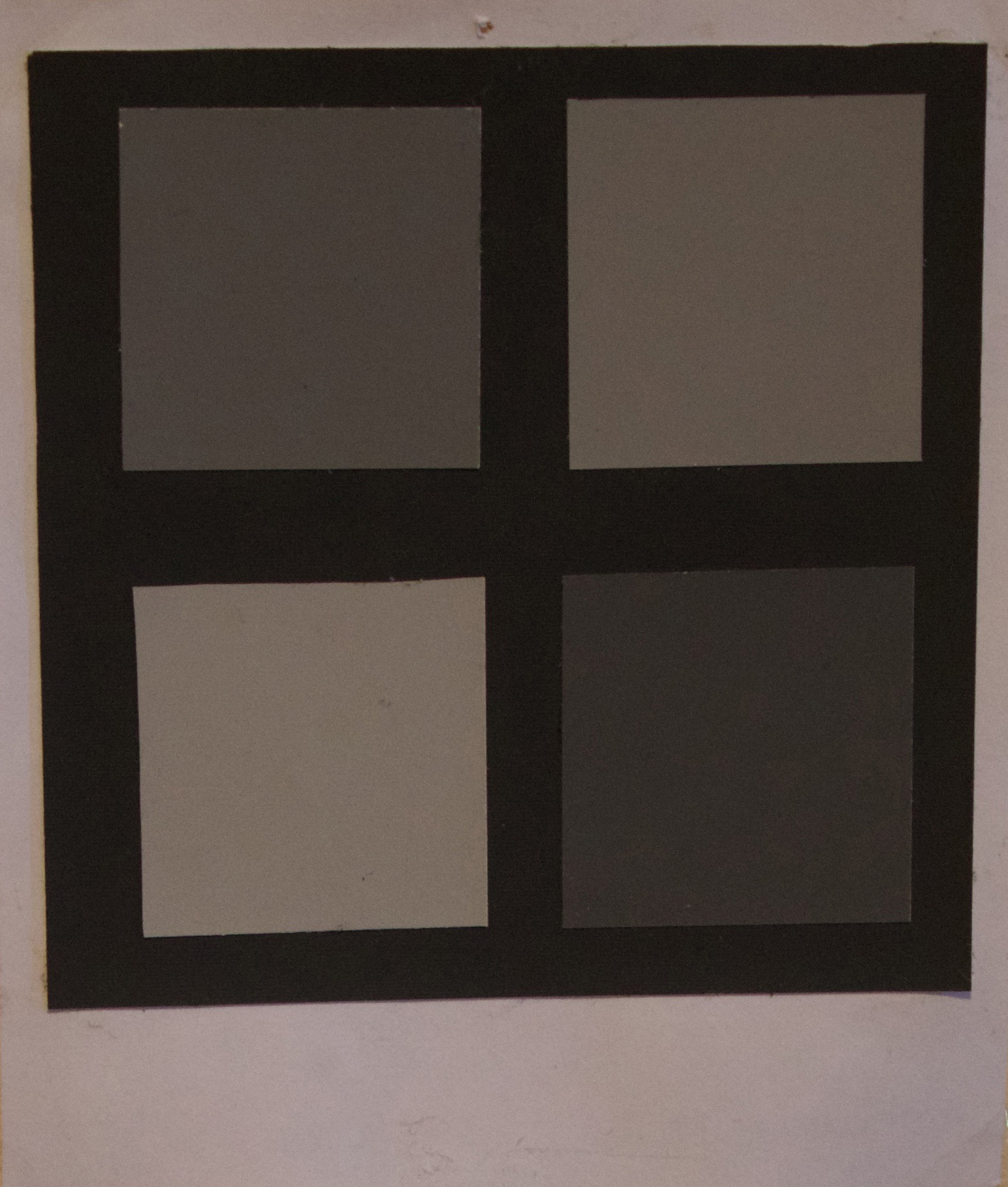
Black & White
This project was to see the effect of a light object on a dark background vs. a dark object on a dark background, cause the light object to pop.
-
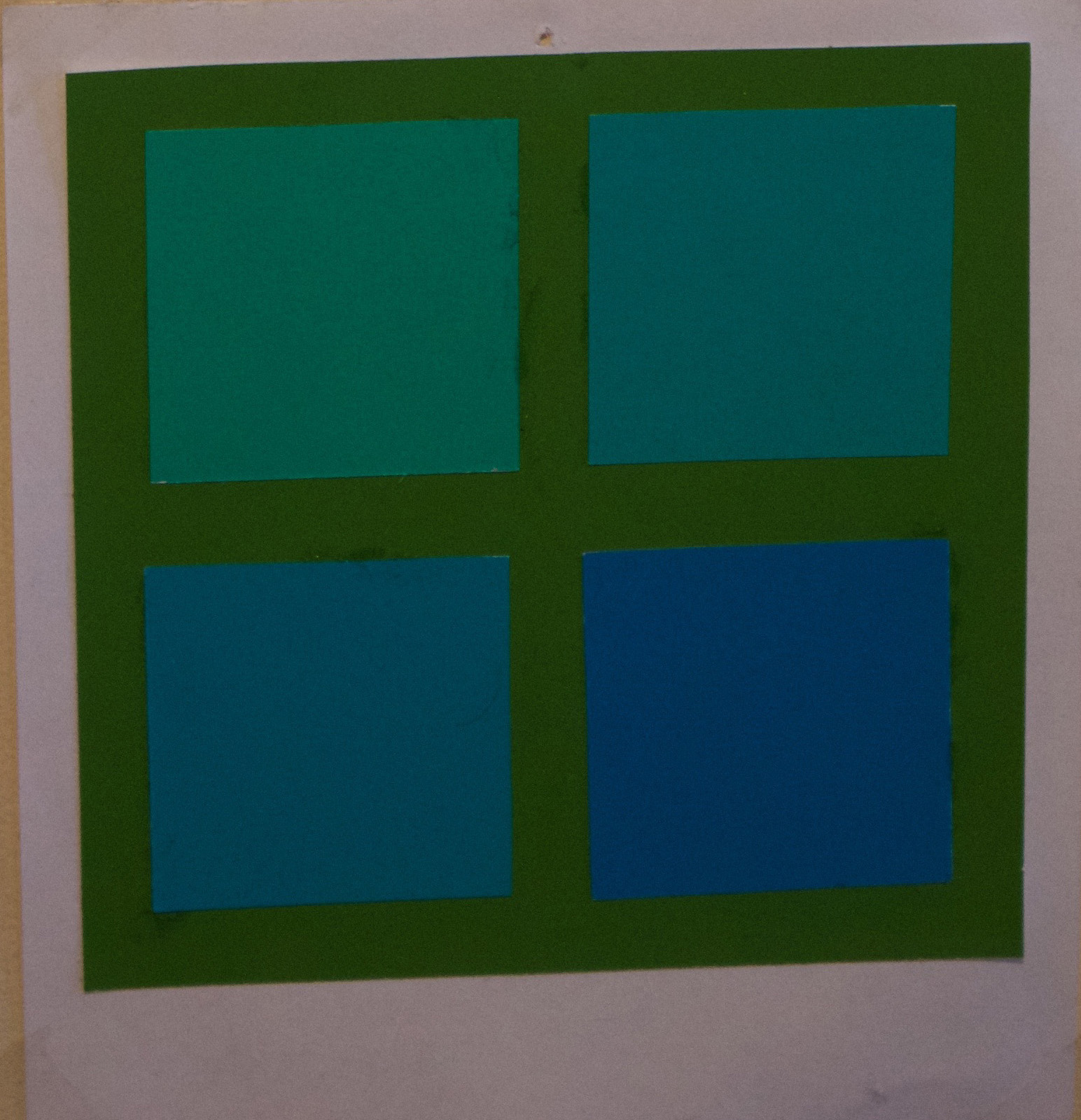
Same Hue
This project was to see the effect of how different values of the same hue effect one another differently.
-
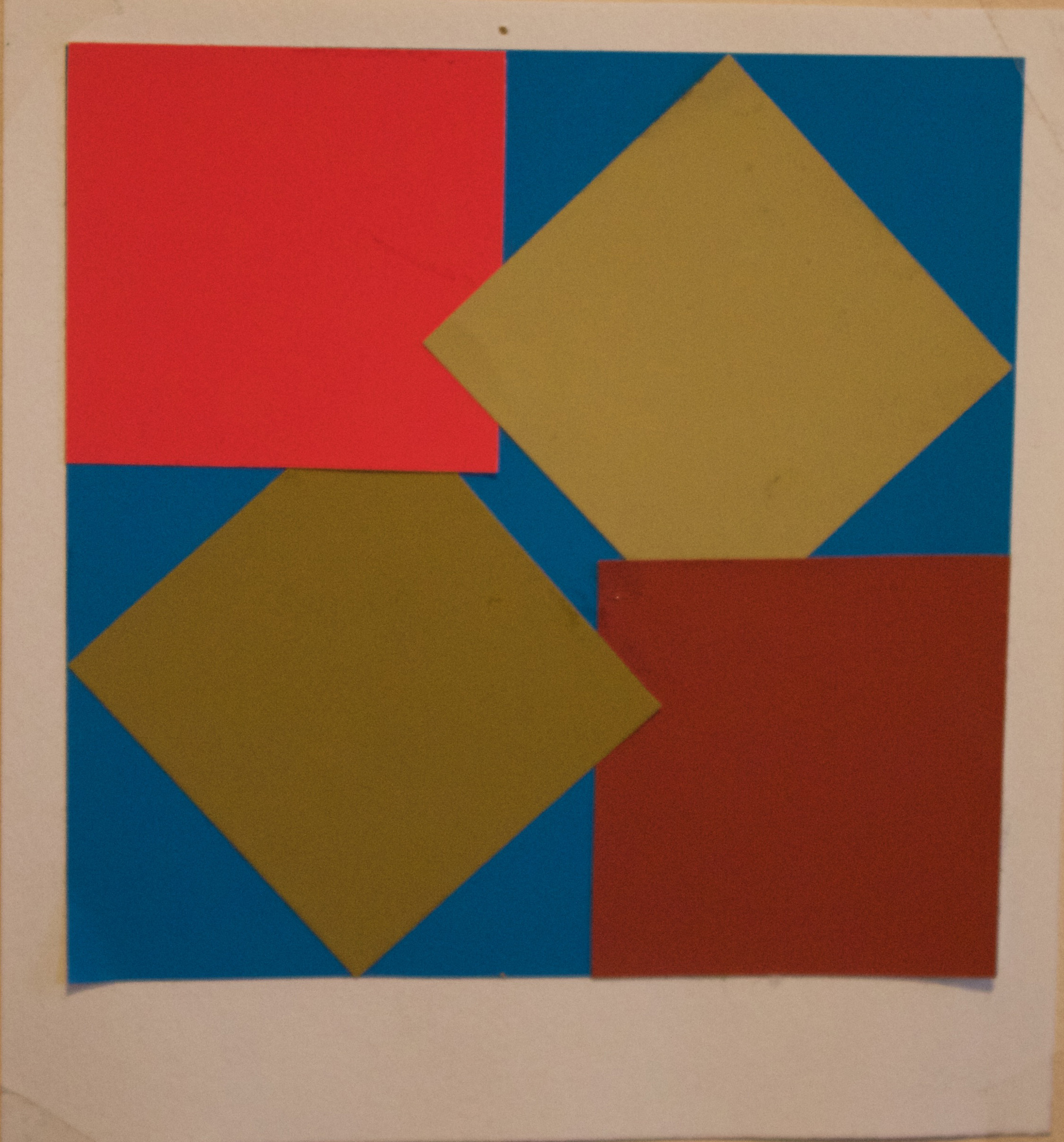
Background vs. Foreground
This project was an experimental exploration to find out how neutral colors react when placed on top of intense colors vs. below intense colors.
-
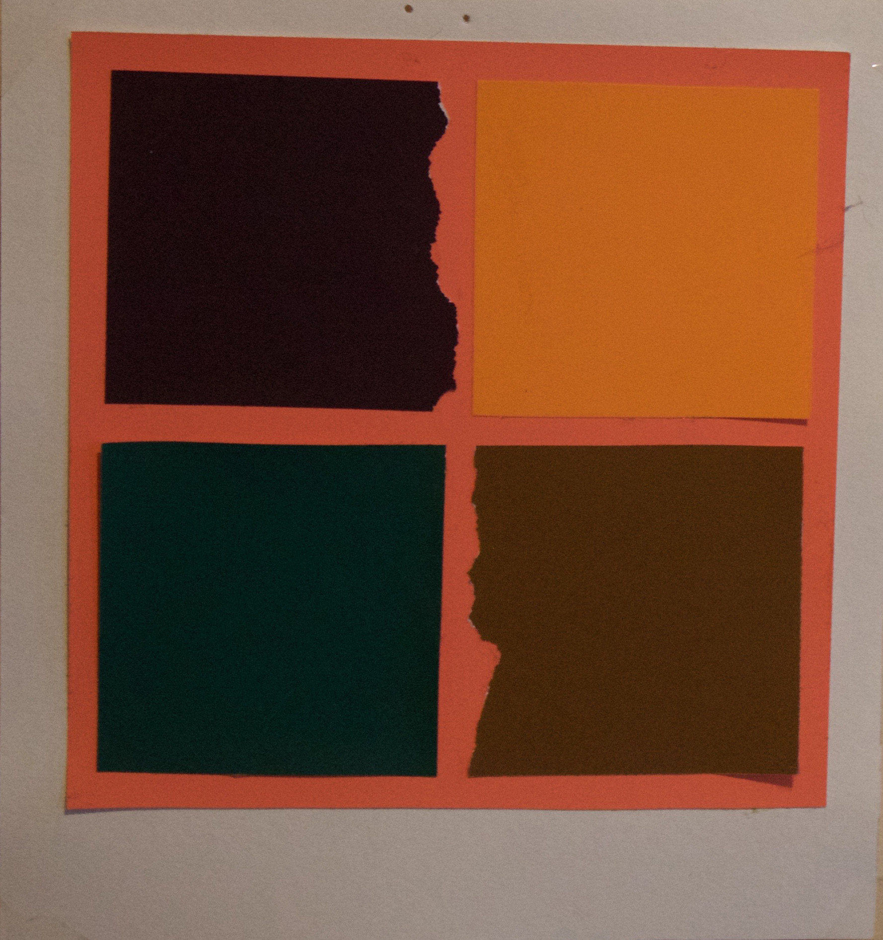
Tear vs. Clean
This project was to explore the effects that teared textures have a background vs. straight clean textures on the same background.
-
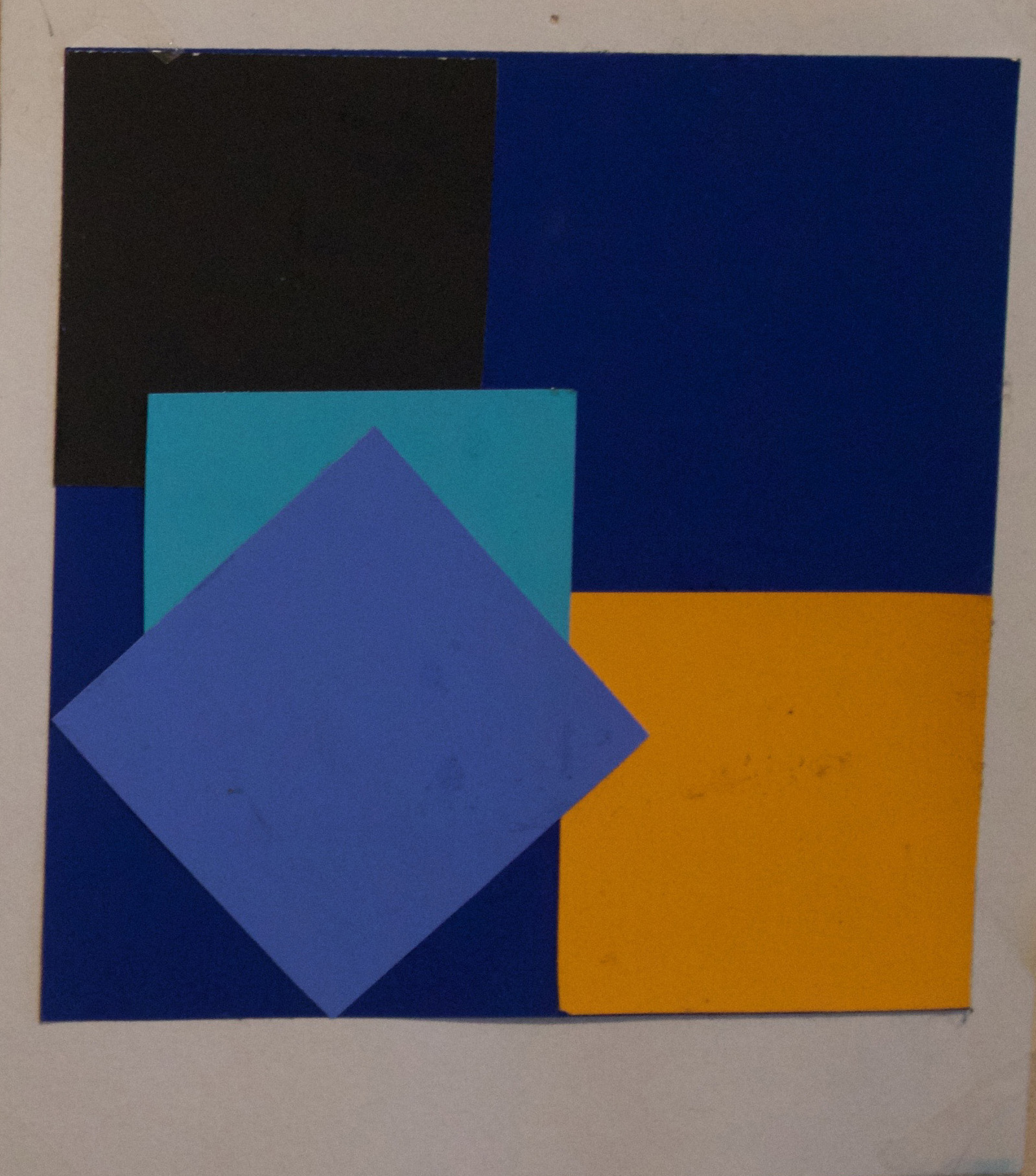
Layering
This project was to explore the effects that layering different hues on top of one another has, sometimes creating that vibration on your eyes at the edges.

Tessellation Designs
-
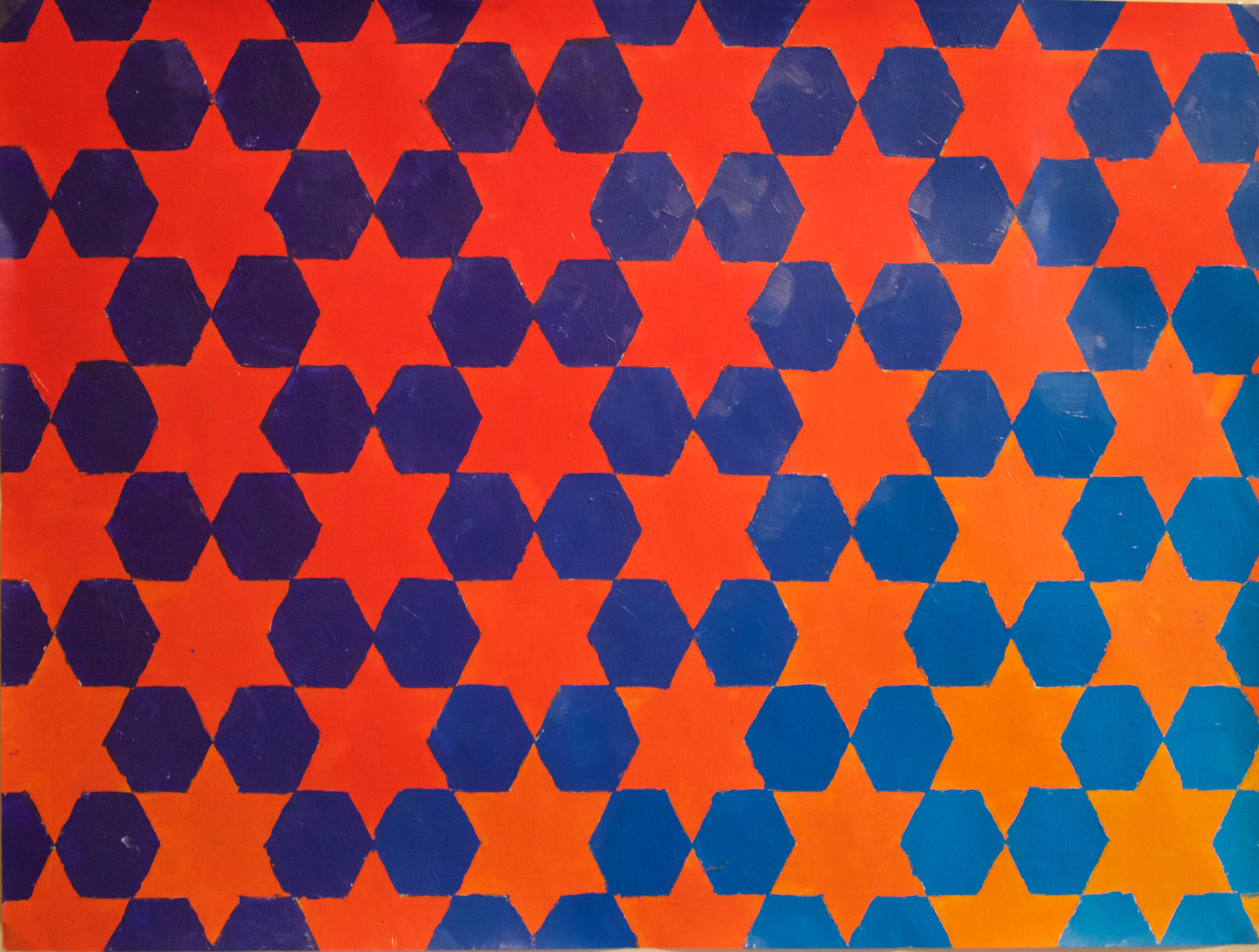
Stars & Hexagons
This design was made by a series of hand-drawn continuous verticle, horizontal and diagonal lines 1 inch apart to form interlocking stars and hexagons, painted with acrylic paint posessing the two themes of gradient and temperature.
-
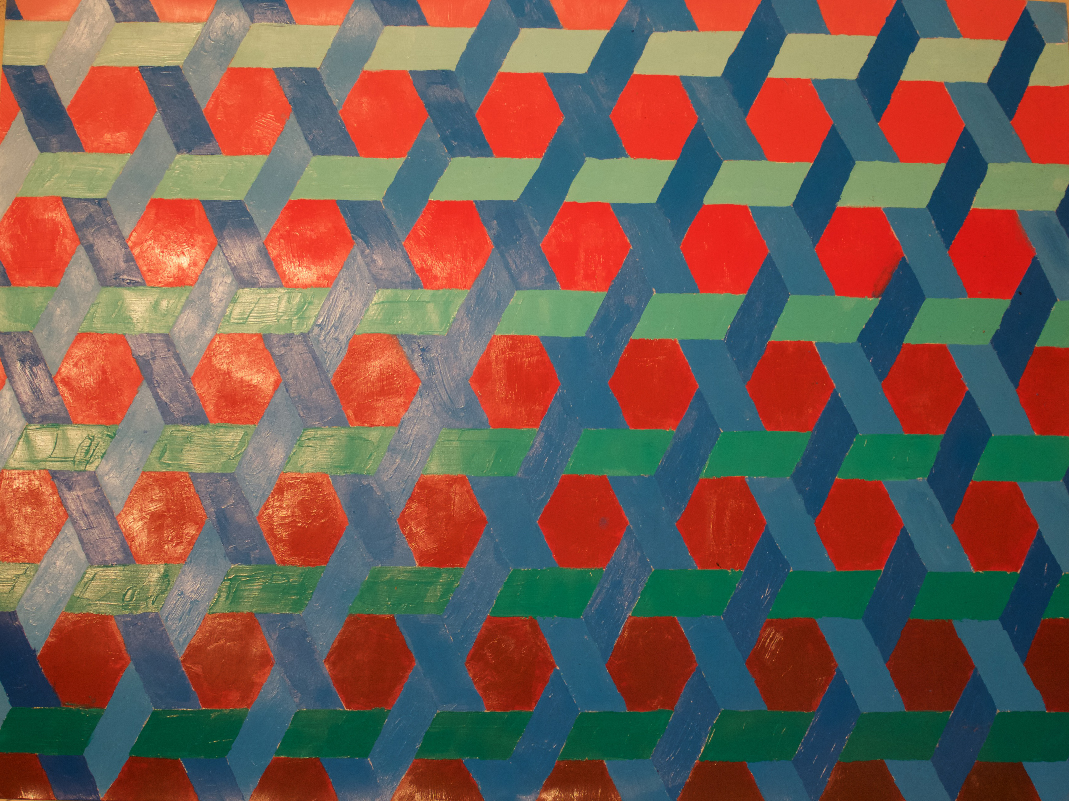
Weave With Hexagons
This design was also made by a series of hand-drawn continuous verticle, horizontal and diagonal lines 1 inch apart to form the hexagons and creating a weaving pattern surrounding each hexagon, painted with acrylic paint posessing the theme of value change.
-
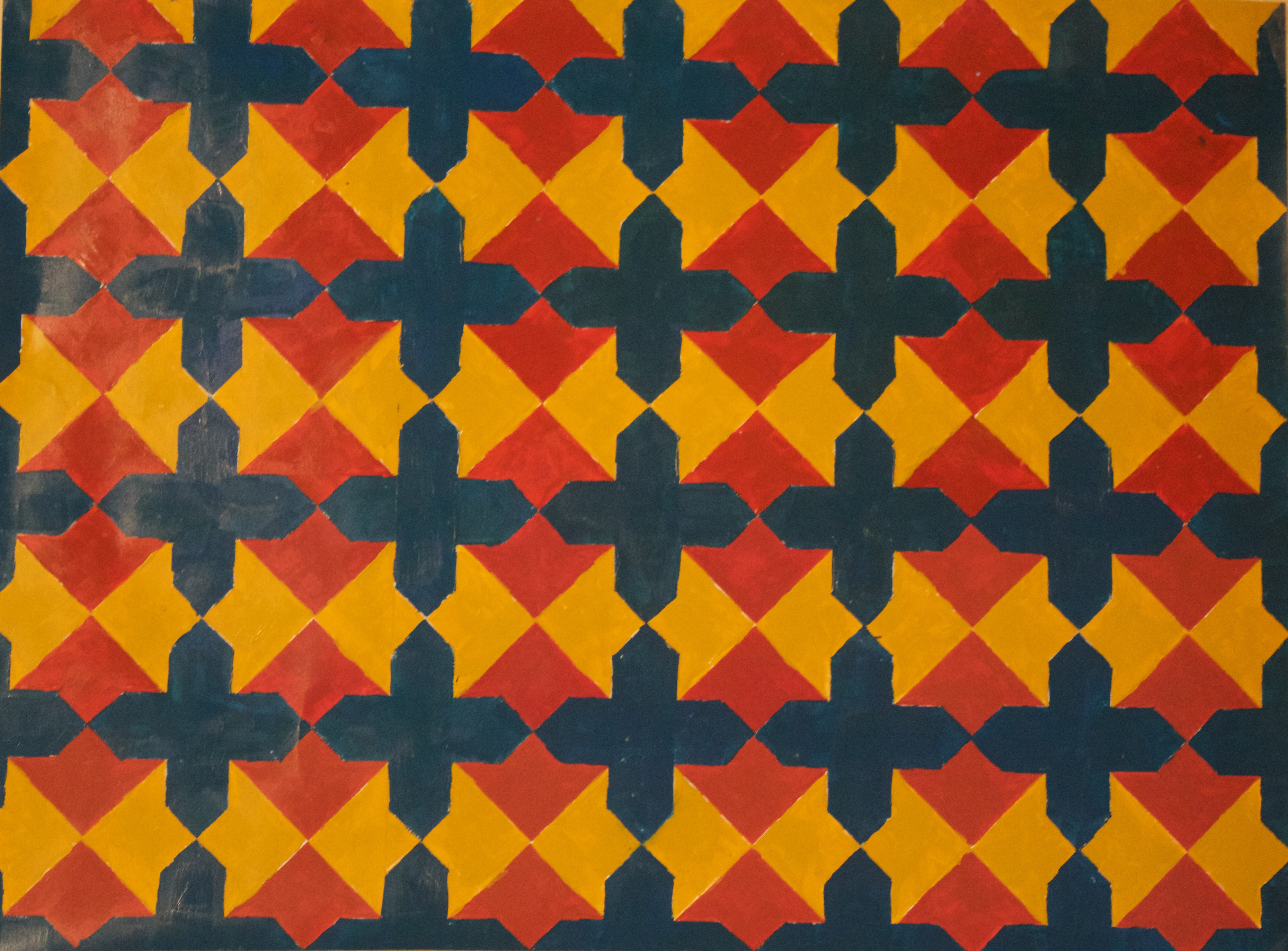
Diamonds & Crosses
This design was made by a series of hand-drawn continuous verticle, horizontal and diagonal lines 2 inches apart to form interlocking diamonds and crosses on top of them. The color pallete is based on the theme of temperature, where the cold blue color stands out as in front of the warm background colors.
-
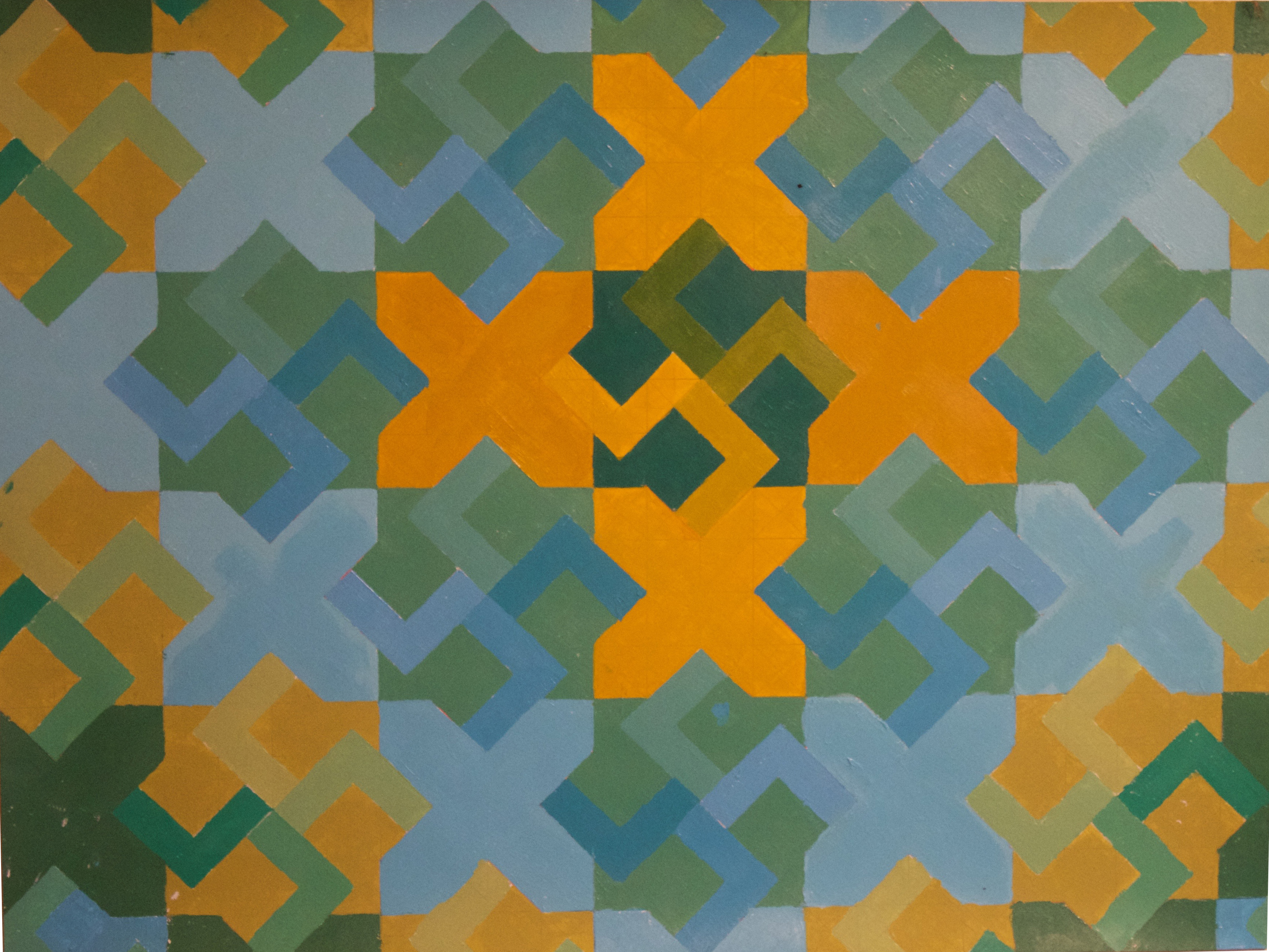
Octagons, Swastikas & X's
The word 'swastika' derives from an Asian Indian Sanskrit word, in which the meaning of the swastika stands for universal welfare. The swastika is one of the most ancient of all symbols and used as a symbol for peace, life and good luck. This design was first done on the computer, creating the design with continuous verticle, horizontal and diagonal lines 1 inch apart done in illustrator rather than hand-drawn. The final design was then printed out and painted over with acrylic paint based on the theme of value change and gradient. As you can see the the value of each octagon graduates around each swastika leading into the next X.
-
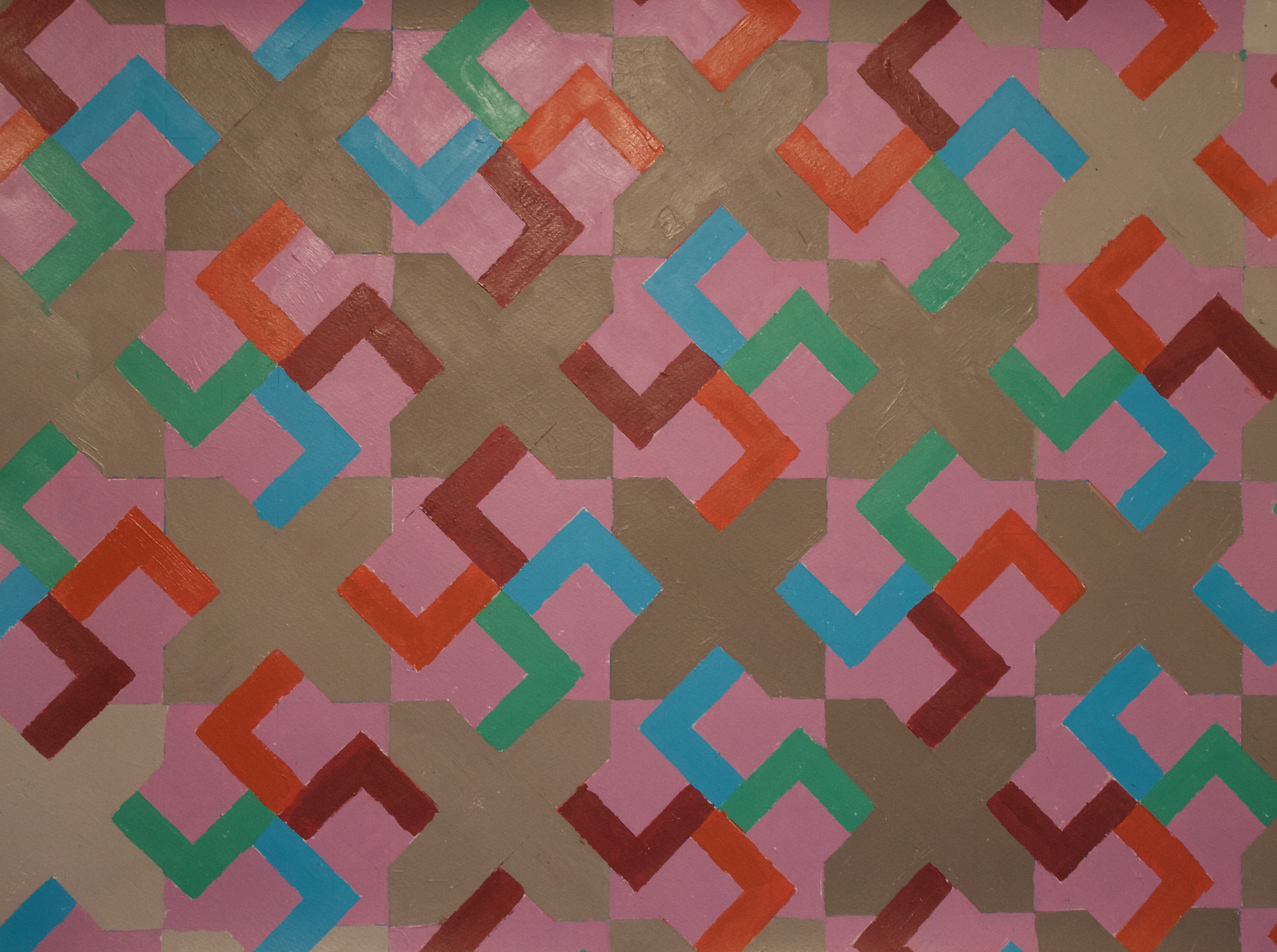
Octagons, Swastikas & X's
This project was done with the same template as the previous one, but with a completely different color pallete. This pallete was based on the theme of intensity, as the pink and grey colors become very neutral against the intense 4 colors of the swastika arms, causing the octagons and crosses to hide in the background while the swastikas pop out.